skip to main |
skip to sidebar
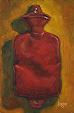
Can O' Barbasol
6"x4" oil on raymar panel. • When I first came back to painting, I took an oath to avoid typography in my paintings. This swearing-off wasn't based in fear of rendering type—I LOVE typography, consider it a high art and think a lowercase Garamond "g" to be one of the most wonderfully gorgeous forms ever created—but rather it is based in my having rendered a heckuva lot of type in my past life. All the way from 6 pt. with a one bristle brush to 6 foot behemoths. That seemed to me to be enough typography for a lifetime. Also, my love of the form would possibly distract me from painting, or so goes the logic in my addled brain. But when painting let's say... a Tootsie Roll, it is hard to avoid type. So, I have somewhat loosened up on my type banishment and let it creep in here and there (e.g., the above). • Just as I would encourage any artist to study the human form, I would also encourage them to study typography. You will probably encounter it at some time in your work, and even if you don't, it is a wonderful art in and of itself and well worth the learning. There is a natural flow to it, just as with the human body. That's my rant for the day. Please deposit a nickel in your machine.
Posted April 3, 2013
sold • private collection west hollywood, ca


Even your paint application conjures up shave cream. Love the red especially.
ReplyDelete