skip to main |
skip to sidebar
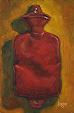
Old Monrovia Gas Station
16"x24" oil on canvas • WARNING: The following rant will be long and quite possibly the most
boring ramble you will read over the next two years. I'm going for a
record here, so if you're poaching eggs, better go and keep an eye on
your timer—you don't want to overdo your eggies and the timer will be
much more exciting to watch than this diatribe is to read. •
This is one of four pieces that I recently had professionally
photographed. When I went to pick up the pieces after they were shot, I
slipped into the "backroom" of the studio to talk to the poor suffering
photog who shot them—see if I could pick up some pointers from a pro. I
have found that the pass key to talking to the pros seems to be the
words "cross polarization." If you use this technique, you may not be a
complete noob, just an annoying artist asking too many questions. So, I
whipped those two babies out, getting me to the "Quick Judgement" stage
of the conversation. That's when, in a matter of seconds, they size me
up either as a nice guy who paints pieces that are challenging to
photograph OR as the nefarious S.O.B. that nature created to curse their
very existence by painting those damn pieces that just made their
morning in the studio a nightmare so bad, they upchucked their morning
bagel and coffee. I presented myself as blandly as possible (not a hard
thing for me considering that a plain white wall looks exciting by
comparison) and was judged relatively harmless. After gaining
admittance, I found out that the poor guy suffered just like me when
photographing my work. It always comes down to: "Your colors... MAN!
Don't get me wrong... I love them, but... MAN!" This sentiment is
sometimes accompanied by mild cussing, which I find completely
appropriate for the situation. He proceeded by telling me how he had to
selectively pick and isolate colors in PhotoShop and "... beat them down
with a stick." • I have had similar
conversations with other professional photographers and it is almost
always sung to the same tune. • The commonality of this "challenge" is
really frustrating because the problem can throw the values off—stroke by
stroke—in the digital images of my work. I work very hard on my values.
By values, I don't mean moral values; I am as morally bankrupt as that
neighbor who, undercover of nightfall, chucks snails from their yard into yours. No, I mean the tonal values in my paintings. Values hold a
painting together, if they are off, my work falls apart. If you see a
red in the sky of one of my paintings that appears darker or lighter
than the blues or purples or grays or whatever color is around it, it is
most likely a digital anomaly. In person, that sky may look like thick and gooey sculpted icing on a cake that was applied by a psychotic baker who went
off his meds that day, but at least the values hold together. This is because I
worked back and forth and back and forth, over and over, to get the sky
to work—the red should not appear (much) lighter or darker than its neighbors. • Those
photographic conversations kinda sorta let my own evil, bully of a
camera off the hook... a bit. I still think it is evil, evil, evil, and it hates me, but
it would appear that the digital realm in general is what dislikes my
work. Did I say that my camera is evil? Just wanted to make sure I got that adjective in there. • Okay, that is the end of the rant. Go eat your eggs.
Posted September 5, 2014


No comments:
Post a Comment